
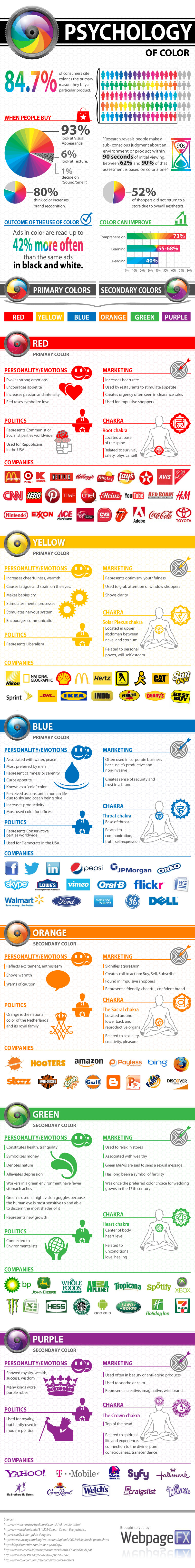
God made the rainbow to have seven colors from white light, which are split up into all the seven colors after a thunderstorm. I love colors and used to play around with my paper of colorful paints. MacDonalds chose the colors red and yellow so that you get excited when you see yellow and buy more food, while red makes you impatient so that you eat and quickly leave after that. Hence, there is a reason why red and yellow are now very popular colors. Companies and banks like Ambank copied or rather created the same colors for their logos. Grey and earthy colors make you look insipid, while bright colors make you stand out from the crowd.
Below is a detailed infographic from webfx.com, which has come out with examples of logos of various colors accordingly. For example, Starbucks and Seven-Eleven chose green as their logo theme. For your information, you might like to know that "If Howard Schultz gave up after being turned down 242 times by banks, there would be no Starbucks." Below is a picture of Mr. Schultz.

Here is a very nice long and detailed infographic by webfx.com with the corresponding company logos sorted according to their color themes. Just check it out yourself, and this picture is worth a million words. When I saw it on Pinterest, it caught my attention, I thought this must be written as a blog post for posterity. Simply click on the infographic to enlarge to its original size to read more details below:

No comments:
Post a Comment